

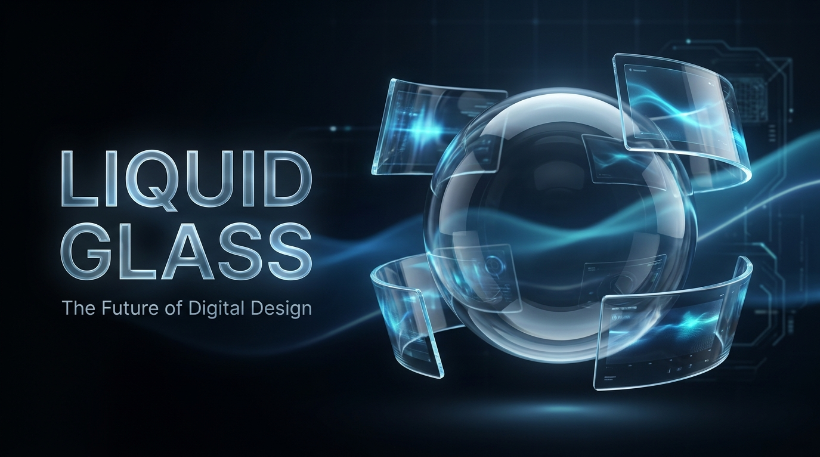
Liquid glass has become one of the most talked-about visual styles in modern technology and digital design. With its translucent surfaces, soft reflections, depth, layered interfaces, and fluid appearance, the style creates a polished look that feels both futuristic and familiar.
But liquid glass is more than a visual trend. It represents a broader shift toward interfaces that use transparency, depth, lighting, motion, and environmental context to make digital experiences feel more tactile.
Whether you are a designer, developer, business owner, or simply curious about modern UI trends, understanding liquid glass can help you recognize where digital design is heading and how to use the style without sacrificing usability.
What Is Liquid Glass?
Liquid glass is a digital design aesthetic that combines transparency, translucency, blur, reflections, gradients, shadows, and layered surfaces to create the impression of glass that is soft, fluid, and almost three-dimensional.
Unlike a traditional flat interface, liquid glass elements appear to exist within a visual space. Background content may remain partially visible through a surface, while blur and lighting create separation between foreground and background.
Common characteristics include:
- Semi-transparent surfaces
- Background blur
- Soft highlights and reflections
- Rounded corners
- Subtle gradients
- Layered depth
- Floating cards and panels
- Smooth animations
- Light and shadow effects
- Fluid transitions
The goal is usually not to make an interface literally look like physical glass. Instead, designers use glass-like visual cues to create hierarchy and depth.
Why Has Liquid Glass Become So Popular?
The popularity of liquid glass comes from a combination of technological improvements and changing design preferences.
Modern devices have powerful displays, advanced graphics capabilities, and operating systems capable of rendering sophisticated transparency and blur effects efficiently. At the same time, users have become accustomed to interfaces that feel more dynamic and immersive.
The style also fits naturally into today’s preference for minimal layouts. Instead of filling a screen with heavy borders and solid blocks, designers can use transparency and depth to separate information while keeping the overall interface visually light.
Another reason is branding. A well-designed liquid glass interface can make a website, application, or digital product feel premium and contemporary without relying on excessive decoration.
Liquid Glass vs. Glassmorphism
Liquid glass is closely related to glassmorphism, but the terms are not always interchangeable.
What Is Glassmorphism?
Glassmorphism became widely recognized as a UI design trend based on translucent panels, background blur, subtle borders, and shadows. A typical glassmorphic card might have a transparent white or dark surface placed over a colorful background.
The effect creates a frosted-glass appearance.
How Is Liquid Glass Different?
Liquid glass generally pushes the concept further by emphasizing fluidity, lighting, depth, motion, and environmental interaction.
A simple comparison looks like this:
| Feature | Glassmorphism | Liquid Glass |
|---|---|---|
| Transparency | High | High |
| Blur | Common | Common |
| Depth | Moderate | Stronger |
| Reflections | Limited | More prominent |
| Motion | Optional | Often important |
| Fluid appearance | Limited | Central |
| Environmental interaction | Basic | More dynamic |
In practice, designers may use elements of both styles. The distinction is less about strict technical rules and more about the overall visual experience.
Key Elements of a Liquid Glass Interface
Creating convincing liquid glass requires more than adding transparency to a box. Several design elements work together to produce the effect.
1. Transparency and Translucency
Transparency allows background elements to influence what users see through the surface.
However, completely transparent objects can become difficult to read. A carefully controlled level of opacity creates the impression of glass while maintaining enough contrast for content.
For example, a navigation panel might use a partially transparent surface instead of a fully solid background.
2. Background Blur
Blur is one of the most recognizable characteristics of glass-inspired interfaces.
When background content is blurred behind a translucent panel, the foreground becomes visually separated while the background still contributes to the overall atmosphere.
The key is moderation. Excessive blur can make a design feel muddy and reduce visual clarity.
3. Reflections and Highlights
Small highlights can make a surface appear more dimensional.
A subtle light reflection along the edge of a panel can suggest that the surface has thickness. Similarly, a soft gradient can imitate how light changes across a curved glass object.
These effects should remain subtle. Strong reflections can quickly make an interface look artificial or distracting.
4. Depth and Layering
Liquid glass works particularly well when multiple layers are used.
For example, a dashboard might contain:
- A dark background
- A blurred ambient gradient
- A translucent navigation panel
- Floating glass cards
- Bright content elements above those cards
This creates a sense of spatial hierarchy without requiring thick borders around every component.
5. Motion
Animation can make liquid glass feel genuinely fluid.
Panels can gently fade or slide into position. Hover effects can change reflections or lighting. Background shapes can move slowly behind transparent surfaces.
The most effective animations are usually subtle. Motion should communicate interaction or depth rather than simply exist for decoration.
How to Use Liquid Glass in Web Design
Liquid glass can work particularly well for websites that want a futuristic, premium, or technology-focused identity.
Use It for Hero Sections
A glass panel over an atmospheric background can create a strong first impression.
For example, a technology company could use a dark gradient background with slowly moving light particles behind a translucent hero card. The main headline and call-to-action could sit inside the glass layer.
This approach creates depth without overwhelming the page.
Use Glass Cards Carefully
Glass cards are useful for:
- Pricing information
- Product features
- Statistics
- Testimonials
- Navigation
- Portfolio projects
- Dashboard widgets
However, not every element needs to be a glass card. Using the effect everywhere can eliminate hierarchy and make the entire interface look flat despite technically containing many layers.
Combine Glass With Solid Elements
One of the easiest ways to improve readability is to mix translucent and solid components.
For example, the background and secondary cards can use liquid glass while important buttons remain solid.
This creates a clear visual distinction between interactive elements and decorative surfaces.
Liquid Glass in Mobile and App Interfaces
Liquid glass can be especially effective on mobile devices because small screens benefit from layered interfaces.
A translucent bottom navigation bar, for example, can allow the content behind it to remain visible while visually separating navigation from the main content.
Similarly, floating controls can appear above an application without consuming the visual weight of a large solid panel.
Performance should be considered, though. Blur, transparency, shadows, and animations can require additional rendering resources. Developers should test complex effects across different devices rather than assuming every phone will handle them equally well.
Common Liquid Glass Design Mistakes
A visually impressive effect can still produce a poor user experience if it is used incorrectly.
Too Much Transparency
If text sits directly over a busy background, readability can suffer.
The solution is to increase surface opacity, simplify the background, or strengthen the contrast between text and its surrounding surface.
Excessive Blur
Blur should establish depth, not hide the interface.
When everything is heavily blurred, users may struggle to identify what is behind a panel or understand which elements are important.
Weak Contrast
Accessibility should remain a priority. Light text on a bright translucent surface may look attractive in a design mockup but become difficult to read in real-world conditions.
Always test contrast across different backgrounds and display settings.
Too Many Effects
Adding gradients, glows, reflections, shadows, animations, particles, and transparency to every component can quickly turn a sophisticated design into visual noise.
Liquid glass works best when the effects support hierarchy instead of competing with the content.
Is Liquid Glass Good for SEO?
Liquid glass itself does not directly improve search rankings.
Google evaluates many factors related to usefulness, relevance, page experience, content quality, accessibility, performance, and technical SEO. A visually impressive interface cannot compensate for weak content, poor structure, slow loading, or an unusable mobile experience.
That means designers should separate visual presentation from search optimization.
A liquid glass website can still have:
- Semantic HTML
- Descriptive page titles
- Strong headings
- Useful written content
- Optimized images
- Fast loading times
- Mobile-friendly layouts
- Accessible navigation
- Descriptive internal links
The best approach is to use liquid glass as a visual layer while keeping the underlying website technically sound and content-rich.
How to Make Liquid Glass More Accessible
Accessibility should be considered from the beginning rather than added later.
Use sufficient color contrast, provide visible focus states, avoid making essential information dependent on transparency, and ensure interactive elements remain recognizable.
Motion should also be handled carefully. Users who prefer reduced motion should be able to experience the interface without unnecessary animation.
A beautiful design is more effective when people can actually use it comfortably.
Will Liquid Glass Become a Long-Term Design Trend?
Some visual trends disappear quickly, while others influence design for years.
Liquid glass may evolve rather than remain exactly as it looks today. Designers are increasingly experimenting with more natural lighting, responsive surfaces, spatial interfaces, and interfaces that react to their surroundings.
The important idea is not the exact appearance of a transparent card. It is the broader move toward interfaces that feel layered, contextual, and dimensional.
As display technology and browser capabilities continue to improve, designers will have more opportunities to create digital environments that feel less like flat pages and more like interactive spaces.
Tips for Using Liquid Glass Successfully
If you want to experiment with liquid glass, keep these principles in mind:
Start With Hierarchy
Decide which elements deserve attention before applying visual effects. The strongest glass effect should not automatically be placed on the most important content.
Keep the Background Interesting but Controlled
Liquid glass benefits from something behind it, such as gradients, subtle imagery, or ambient lighting. However, the background should never compete with the foreground.
Prioritize Readability
If an effect makes text harder to read, reduce the effect. Design should serve the user rather than the other way around.
Use Consistent Lighting
If one glass card appears illuminated from the left while another appears illuminated from the bottom, the interface can feel inconsistent. Establish a visual lighting direction and maintain it throughout the design.
Optimize Performance
Avoid unnecessary layers and heavy effects. Test the website on slower devices, mobile connections, and different screen sizes.
The Future of Liquid Glass
The future of liquid glass is likely to involve more responsive and intelligent interfaces.
Instead of static translucent cards, future designs may use surfaces that dynamically react to content, movement, lighting, and user interaction. Background elements could subtly influence foreground colors, while animations could create a stronger sense of physical space.
This evolution could make interfaces feel increasingly immersive without requiring complicated layouts.
However, the fundamentals will remain important: clarity, accessibility, consistency, performance, and useful content.
Conclusion
Liquid glass represents a modern approach to digital design that combines translucency, blur, lighting, depth, reflection, and motion to create immersive interfaces. While it shares similarities with glassmorphism, liquid glass places greater emphasis on fluidity, spatial depth, and dynamic visual interaction.
Used thoughtfully, the style can make websites and applications feel premium, futuristic, and engaging. Used excessively, it can hurt readability, accessibility, performance, and usability.
The strongest liquid glass designs are therefore not simply the ones with the most transparency or visual effects. They are the ones where every effect has a purpose.
As digital interfaces continue moving toward richer, more responsive experiences, liquid glass offers an interesting glimpse into how the next generation of web and app design may look. For designers and developers, the best strategy is to experiment with the aesthetic while keeping the fundamentals of great UX, accessibility, performance, and SEO firmly in place.