

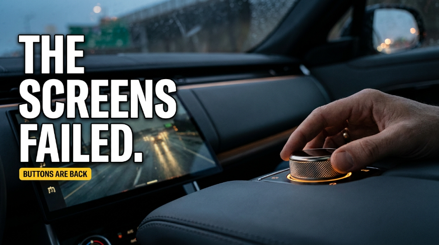
I was driving a rental sedan down Interstate 94 outside Chicago on a rainy Tuesday night last November when the windshield suddenly began to haze over. It was that greasy condensation that spreads the second cold rain meets warm cabin air.
Naturally, I reached my right hand out to crank the defroster.
My fingers met nothing. Just a cold, flat, glossy slab of glass staring back at me in the dark.
To clear the glass before oncoming headlights turned into blind halos of glare, I had to look down away from the asphalt, find a tiny glowing icon labeled “Climate,” wait a moment for the interface to load, and then steady my finger on a digital slider while the car bounced over pavement seams at sixty-five miles an hour. It took four seconds. Four seconds does not sound like much at a desk, but at highway speed, four seconds means traveling nearly four hundred feet without your eyes on the road.
I remember wondering right then: when did basic driving controls turn into a smartphone app from hell?
For nearly a decade, car companies treated dashboards like giant iPads on wheels. If a physical control could be deleted, wired into a computer chip, and rendered as an animated pixel on a central display, automakers did it. They called it clean. They called it modern.
Now, the pendulum is finally swinging back. After years of drivers complaining about tapping through nested menus to adjust basic cabin functions, safety regulators have stepped in. Starting in 2026, the era of turning every cockpit into a featureless sheet of glass is officially cracking.
How a piece of glass became an excuse to cut corners
To understand how we ended up with such clumsy dashboards in the first place, you have to follow the money. Automakers pitched minimalist interiors as high-end design, but anyone who knows manufacturing understands the real motive: physical switches are expensive.
A real button requires a dedicated injection mold, internal springs, mechanical contacts, wiring harnesses, and human workers on the assembly line to click it into place. Multiply that across volume dials, climate knobs, mirror toggles, hazard flashers, and wiper stalks, and you are looking at hundreds of separate physical parts per vehicle.
A touchscreen replaces all of that with a single display panel and a circuit board.
Once the screen is installed, adding twenty new vehicle functions costs an automaker almost nothing. It is just software code written in an office, rather than copper wire routed through a firewall. Silicon Valley popularized the look, and legacy automakers in Detroit, Germany, and Japan scrambled to copy it so their cockpits looked modern in dealership showrooms.
The trouble is that a smartphone and a car cabin have opposite design needs. When you use your phone on the couch, your full visual attention is on the screen. When you are piloting a two-ton vehicle down an interstate, your eyes belong out the windshield.
A physical knob gives you immediate tactile feedback. You reach over, feel the notched plastic with your fingertips, rotate it three clicks clockwise, and you have warmed the cabin by two degrees without taking your eyes off the lane lines. On a flat pane of glass, every millimeter feels identical. Your fingertips cannot feel a pixel. The only way to know if you hit the target is to look away from the road.
What car companies sold as luxury was really just manufacturing thrift masquerading as progress.
The 2026 safety rule that broke the touchscreen spell
Drivers hated this setup for years, but customer complaints rarely force car companies to retool their factories. What finally broke the dam was safety testing.
Europe’s premier automotive crash-test authority, the European New Car Assessment Programme, decided that enough was enough. As highlighted by the European Transport Safety Council and detailed in industry coverage of Carwow’s analysis of Euro NCAP 2026 safety rules, new testing protocols taking full effect in 2026 will directly penalize vehicles that rely solely on touchscreens for core driving duties.
To earn the coveted five-star safety rating that automakers rely on for their marketing, vehicles must provide separate, physical controls—whether buttons, levers, stalks, or rotary switches—for five critical functions: turn signals, hazard warning lights, windshield wipers, horn, and emergency SOS calling.
The testing updates on Euro NCAP’s official platform make the reasoning obvious: drivers hunting through software menus are distracted drivers.
The numbers backing this up are impossible to ignore. A study by the Swedish car magazine Vi Bilägare tested eleven modern touchscreen cars against a twenty-year-old 2005 Volvo V70 that had a dashboard full of traditional plastic buttons. Drivers were asked to perform simple everyday tasks while cruising at sixty-eight miles per hour: activate the heated seat, reset the trip computer, lower the cabin temperature, and tune to a specific radio station.
In the old Volvo, the driver completed all four tasks in ten seconds flat, traveling roughly three hundred meters. In some of the touchscreen electric vehicles, completing the exact same tasks took forty-four seconds. At highway speed, that meant traveling more than thirteen hundred meters—nearly a full mile—with attention pulled toward a digital screen.
When independent testing proves that your sleek screen makes drivers four times slower at basic tasks, the argument for digital purity collapses.
What muscle memory gets right that software never will
Tech enthusiasts often argue that voice commands and software updates solve this problem. “Just tell the car to defog the windows,” they tell you.
If you have ever tried yelling at a car voice assistant while kids are talking in the back seat and music is playing, you know how hollow that promise is. Voice recognition works fine in a quiet garage, but waiting three seconds for a server to process your request before telling you “Sorry, I didn’t catch that” is no substitute for a mechanical switch.
Muscle memory is fast, quiet, and predictable. It relies on proprioception—the body’s natural ability to sense where its limbs are in space.
When you drive a car with physical dials, your nervous system maps the dashboard in three dimensions. You know the volume dial is four inches below the center air vent. You know the hazard button sits dead center. You know the wiper stalk clicks upward for a single sweep. You execute those commands automatically while your conscious mind stays focused on braking traffic ahead.
Touchscreens destroy that spatial memory. Because a screen can display a million different layouts, buttons do not exist in physical space until software draws them. Worse, modern cars receive over-the-air updates. Drivers wake up to find that an update moved their climate settings into a new sub-menu or replaced a visible toggle with a hidden gesture.
Imagine waking up to find that someone rearranged the burners on your kitchen stove just because a designer thought it looked cleaner. You would never tolerate it. Yet that is what car companies expected us to accept at seventy miles an hour.
Software is built around endless change, but safe driving relies on stable physical habits.
Where car interiors go from here, and the catch nobody mentions
I am relieved that tactile controls are returning, but we need to talk about the catch: automakers are not bringing buttons back because of a sudden moral awakening. They are doing it because failing a safety test hurts vehicle sales.
Because of that, we are already seeing signs of malicious compliance.
The 2026 Euro NCAP rule mandates physical controls for five specific functions: turn signals, hazard lights, wipers, horn, and eCall. Notice what is absent from that list? Temperature controls, fan speed, defrosters, and volume knobs.
Some carmakers are doing the bare minimum to check regulatory boxes. They will bolt on a physical hazard switch and a wiper stalk, but they will leave the defroster and cabin heat trapped inside a laggy sixteen-inch display. That is not an ergonomic triumph; that is regulatory paperwork avoidance.
Still, the broader cultural tide has turned. Volkswagen leadership openly admitted that capacitive steering wheel sliders were a massive mistake, promising real clicky buttons on upcoming models. Hyundai’s design team publicly reaffirmed their commitment to tactile knobs, noting that their buyers actively pushed back against screen-only layouts.
Which brings me back to that rainy night on I-94 outside Chicago. When your windshield fogs over and the semi-truck in the next lane throws up a blinding wave of road spray, you do not want a slick interface, an animated graphic, or a voice assistant. You want a piece of notched plastic that clicks when you turn it.
We spent a decade treating the dashboard like an entertainment tablet, forgetting that its main job is helping a human driver survive the trip home. The return of the button is not nostalgia; it is a long-overdue admission that some tools were already finished.